FYRN
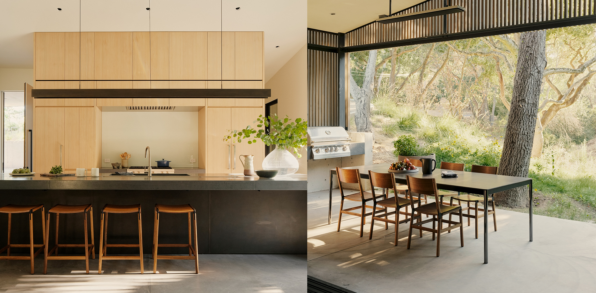
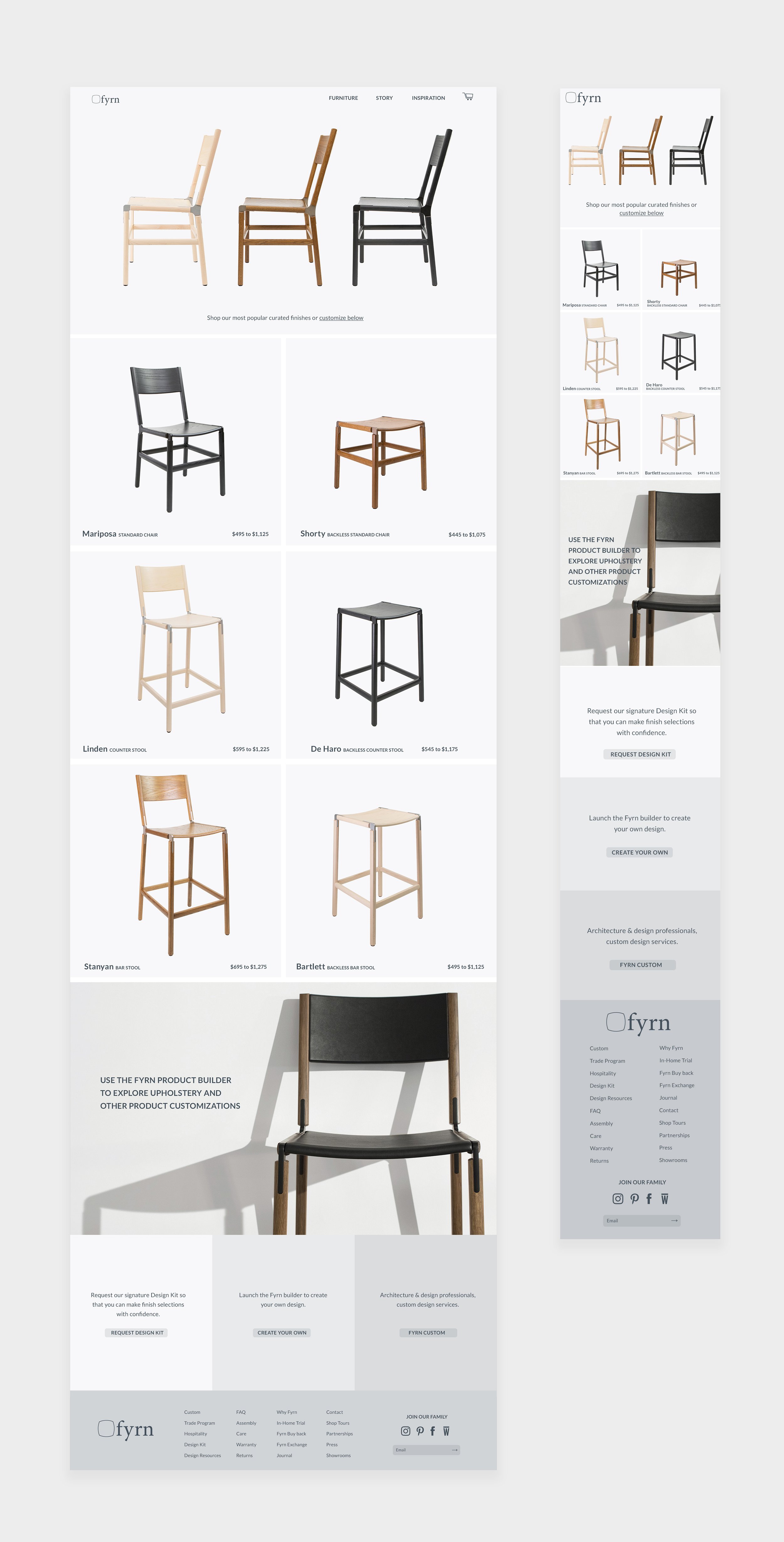
FYRN is a San Francisco-based furniture manufacturer known for their sustainable, handcrafted chairs and recently added tables. Despite being featured in numerous high-end publications and used by respected interior designers in both home and hospitality settings, they required an interim website facelift to expand their offerings to a wider audience. While their existing branding was in place, their visual communication across media was inconsistent. With my suggestion, the brand streamlined their look and feel by settling on a color scheme that tied everything together. Existing photography was thoughtfully curated to breathe new life into it, minimizing noise and unnecessary elements. The result was an elevated look and a friendly user experience.
ROLE | Graphic Designer & Design Director
Collaborated with the Co-founder



CUSTOM PRODUCT BUILDER
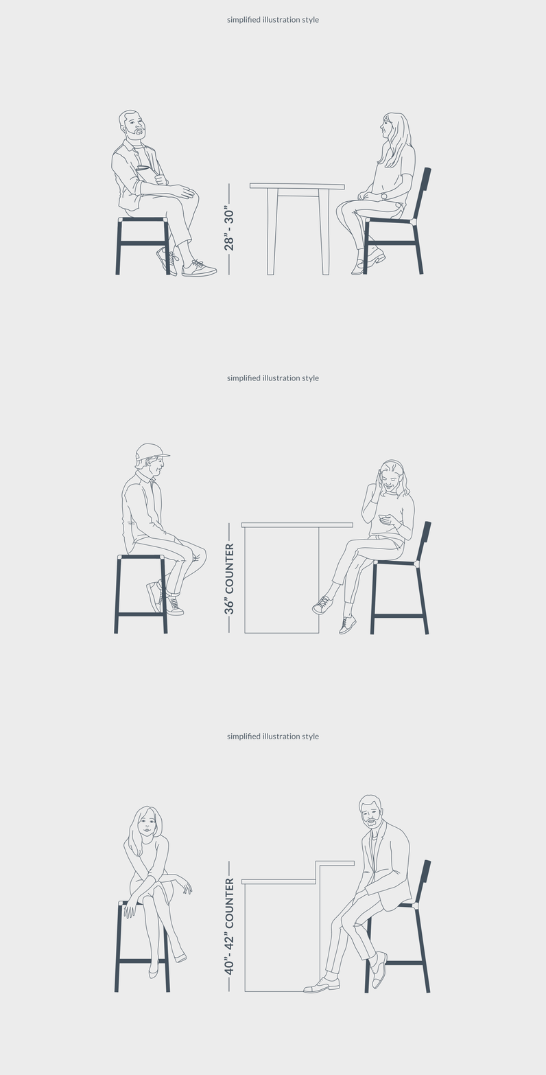
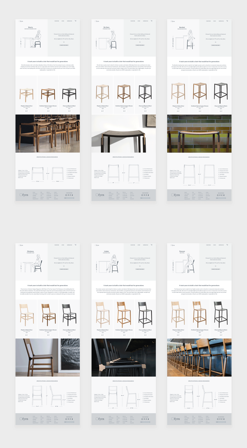
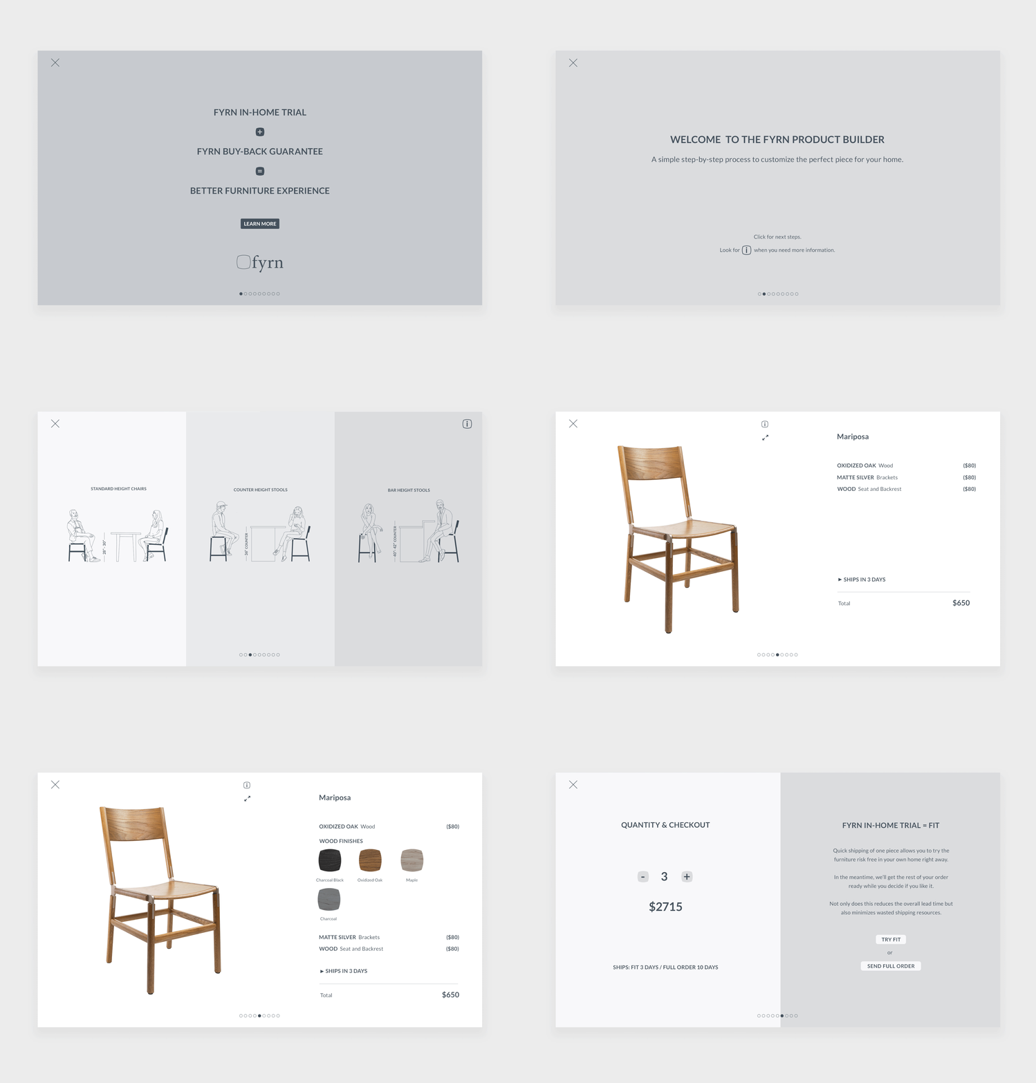
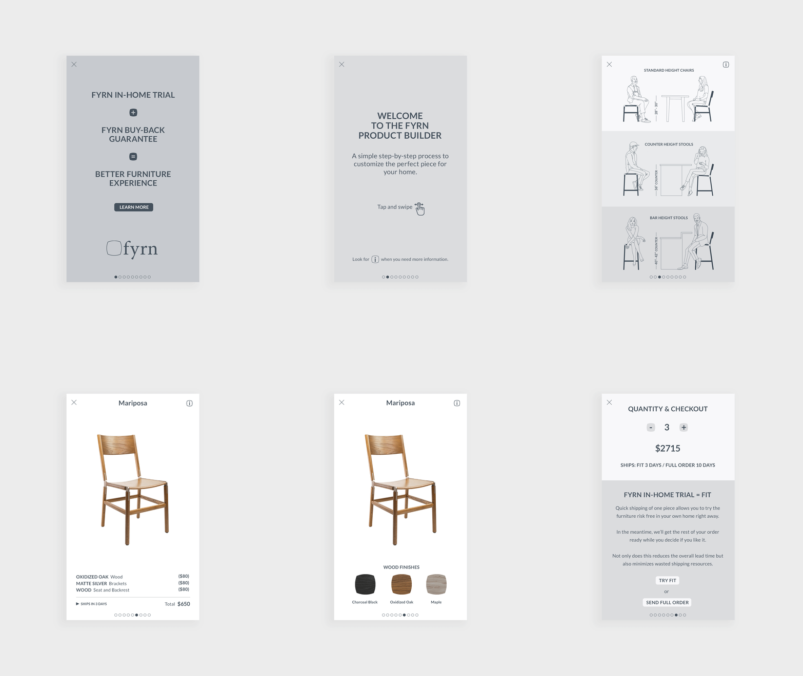
To enhance the brand's online presence, we developed a furniture builder that allowed customers to purchase chairs online instead of through mail order. Inspired by the use of single-stroke lines in the visual communication of brands like Vitso, Sonos, and others, I modernized this element in FYRN's branding. Industry standards like Artemide, Herman Miller, and Floyd served me as a benchmark for premium quality furniture, and I sought to match that level of sophistication.

Photography credits: All images featured on this page are the property of Fyrn. Used with permission.
BRANDING REFRESH
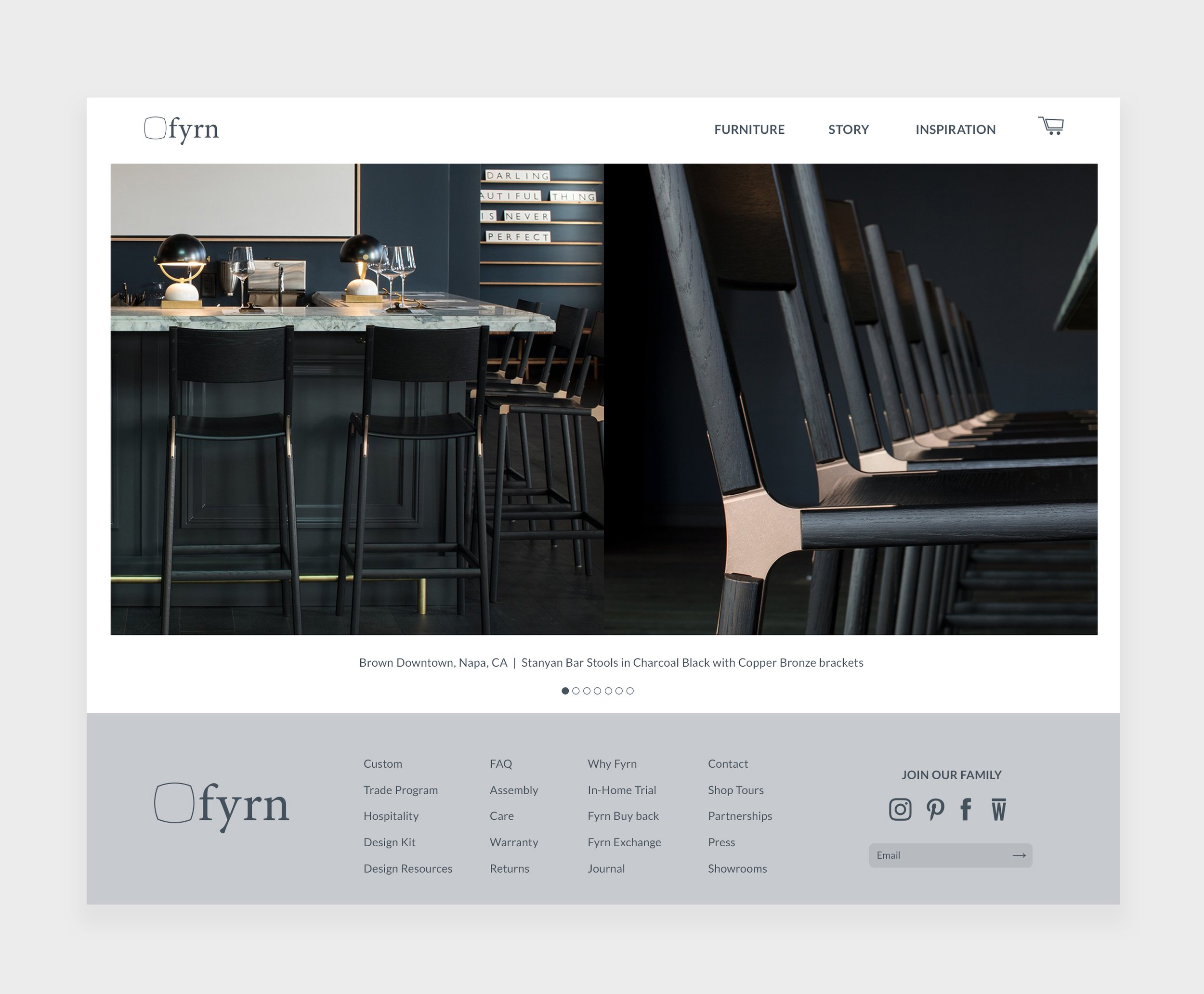
For improved graphic communication and product visibility, I initiated a branding refresh project. Using the gray color from the existing palette as a foundation, I established a new range of gray shades that form the basis of the visual design system. I also restyled the Lato font and integrated product colors and icons using the logo shape, resulting in a prominent and playful branding experience.


